Insights from Accessibility Audit
The accessibility audit employed both manual review and the WAVE Tool to identify usability gaps and compliance issues. This approach ensured the website meets universal design standards, providing an inclusive experience for all users.
1
Manual evaluation was done using 3 principles of WCAG 2.2 guidelines. (A Level & AA Level only).
Perceivable
Operable
Understandable
One additional approach was used for the evaluation, the task was done using keyboard and Screen Reader tool considering blind and visually impaired users.
2
Automatic evaluation was done using the WAVE tool
errors and contrast errors only
Highlights of finding from accessibility audit using both methods
Manual Method
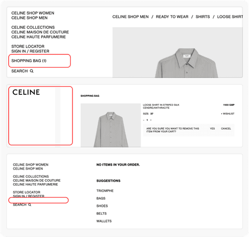
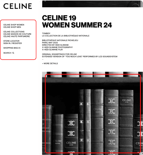
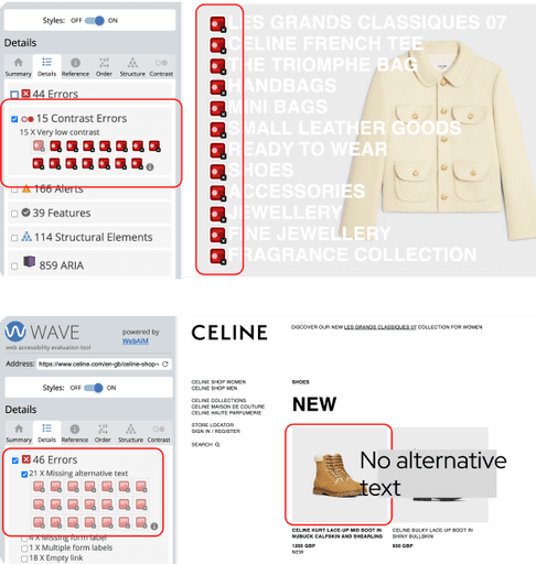
“Alt-text” guideline under perceivable principle was violated in this section. No text alternative was provided to this image
“Text Spacing” guideline under perceivable principle was violated in the navigation bar. The text was clearly not visible and the spacing was not according to the standards.
Automatic Method
15 errors were recorded under “contrast errors” in the navigation page. The text written on the image was not visible.
“44 errors” were recorded in the product listing page. Out of 44, 21 errors were under recorded for missing alternative text.
Data Analysis
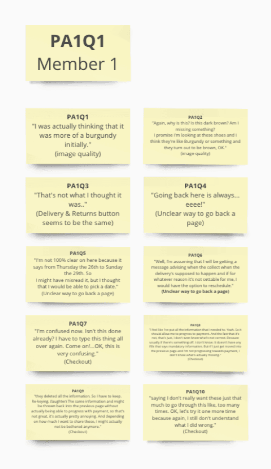
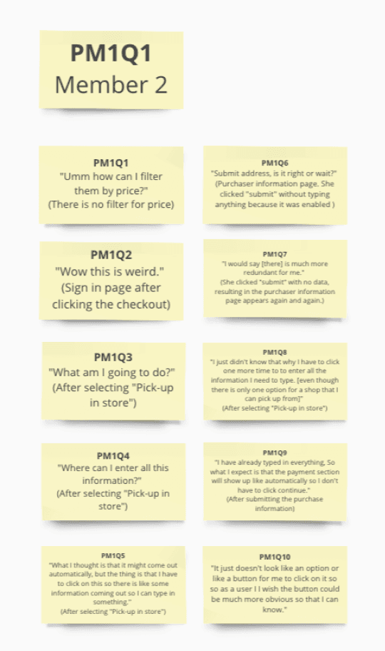
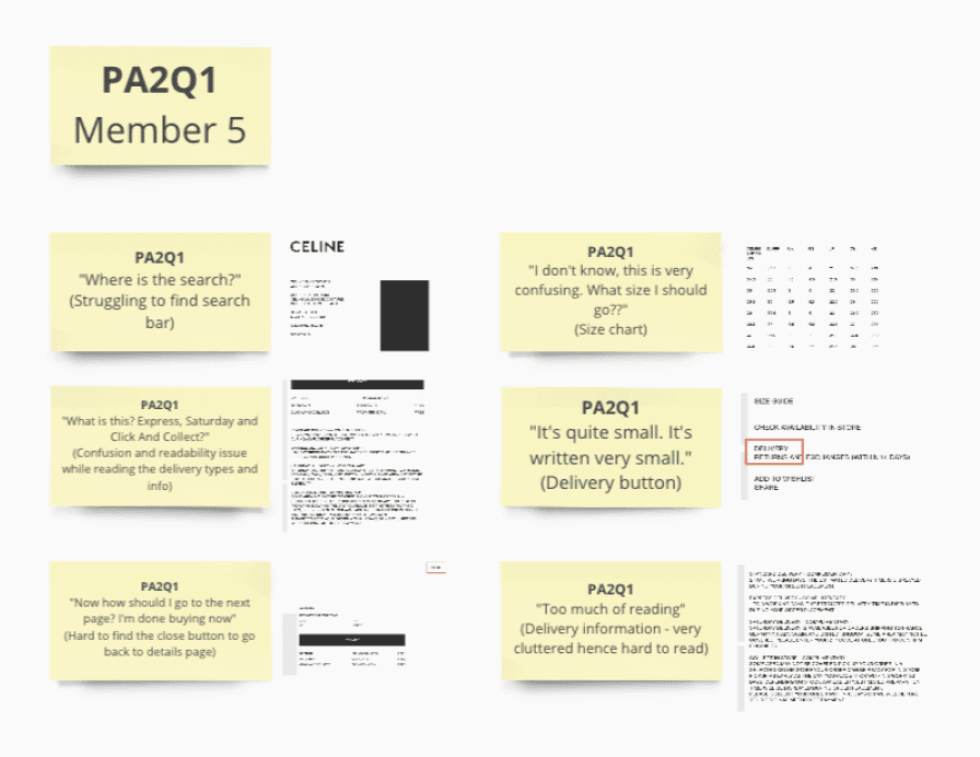
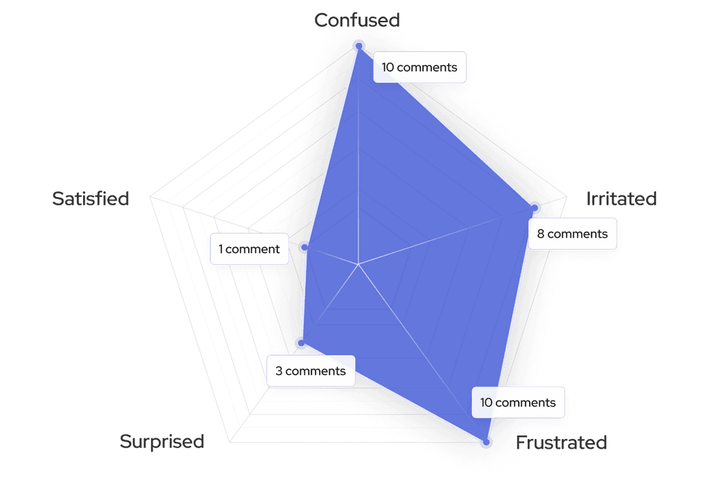
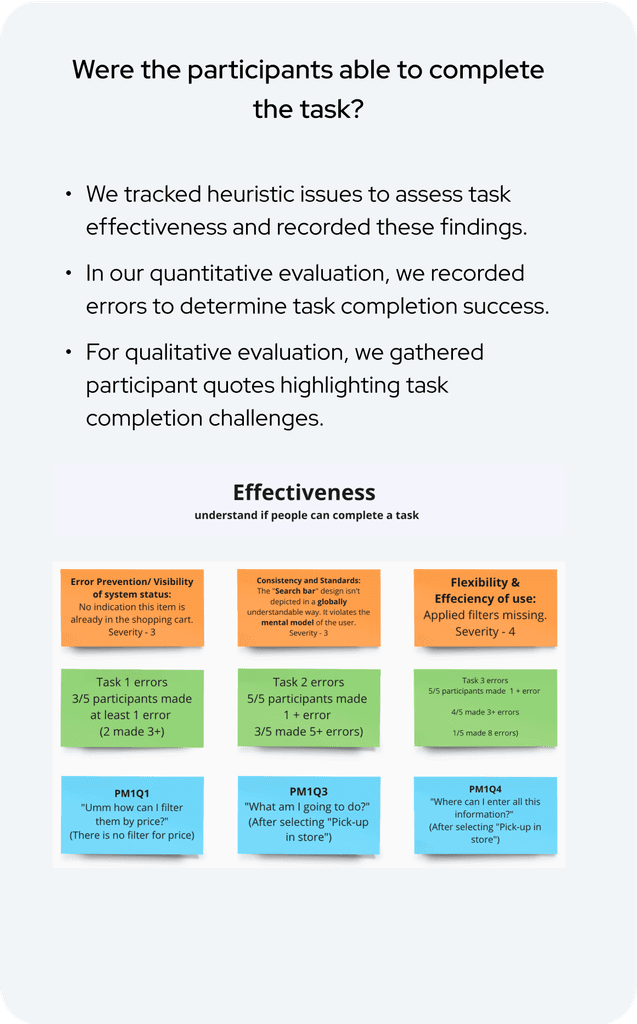
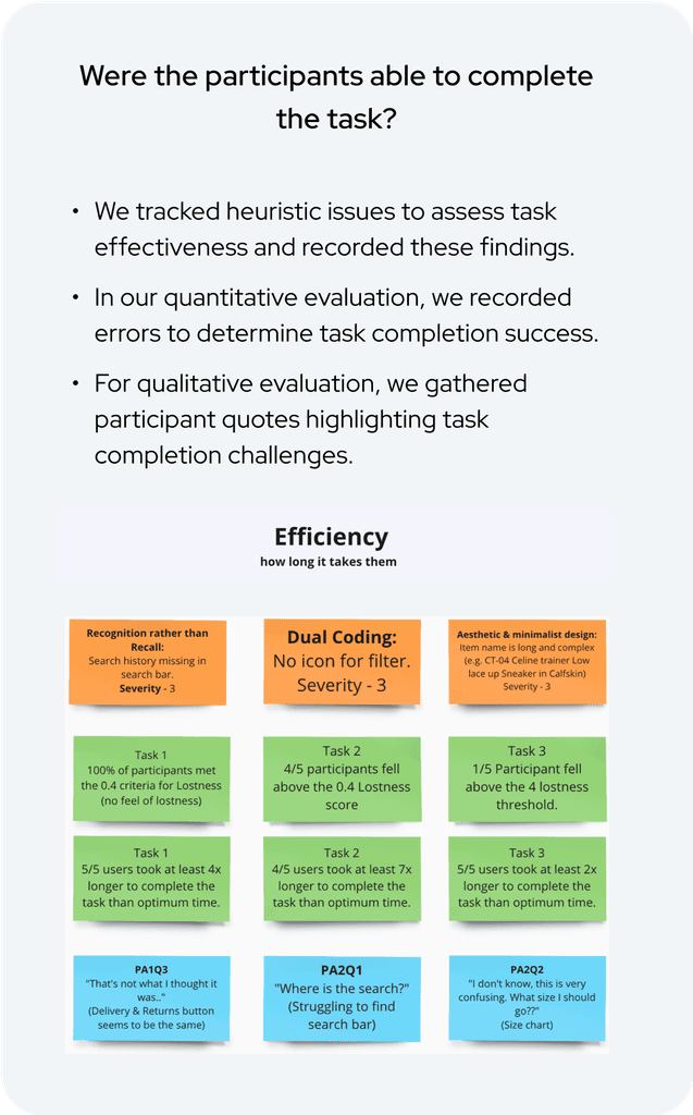
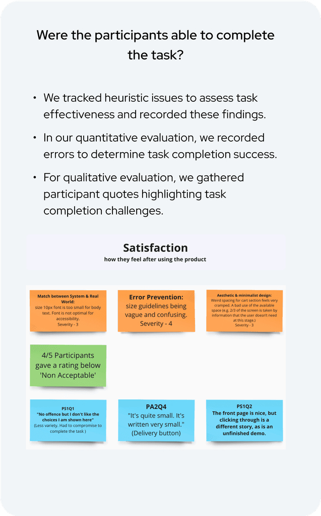
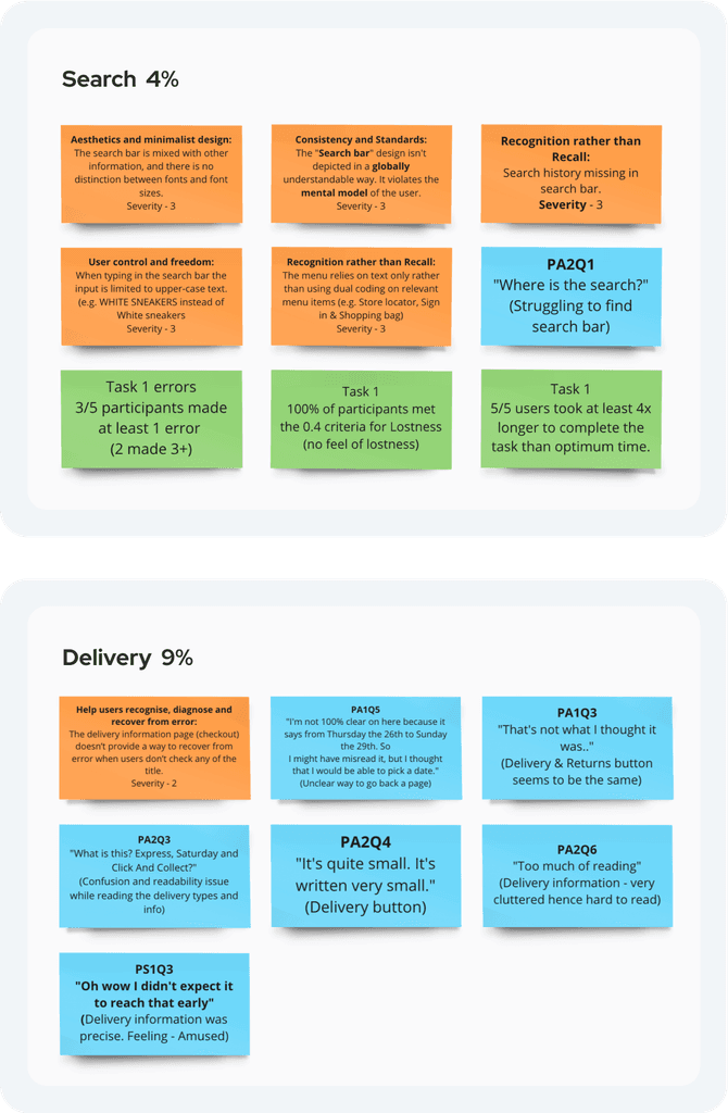
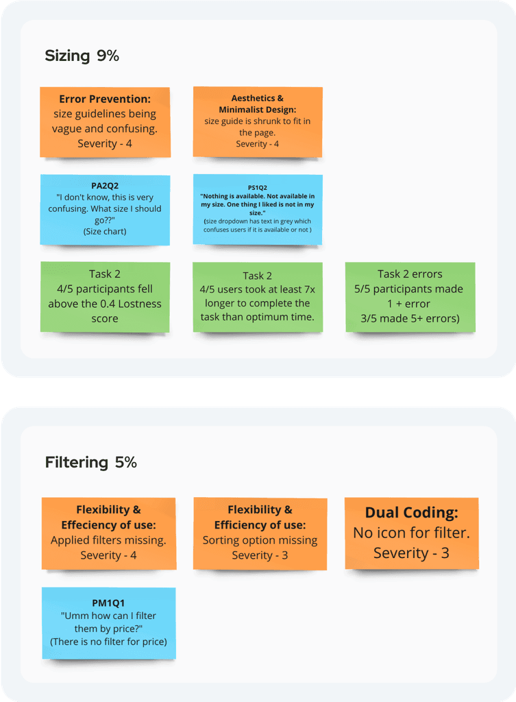
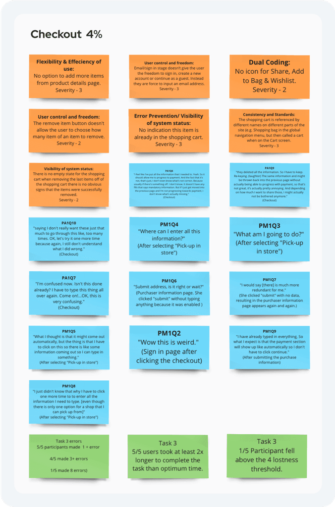
Data from heuristics, quantitative and qualitative evaluations, and an accessibility audit was organized into effectiveness, efficiency, and satisfaction categories, identifying top-performing tasks for comprehensive analysis and understanding of findings.
1
Effectiveness, Efficiency, Satisfaction
2
Top Tasks
Data Evaluation
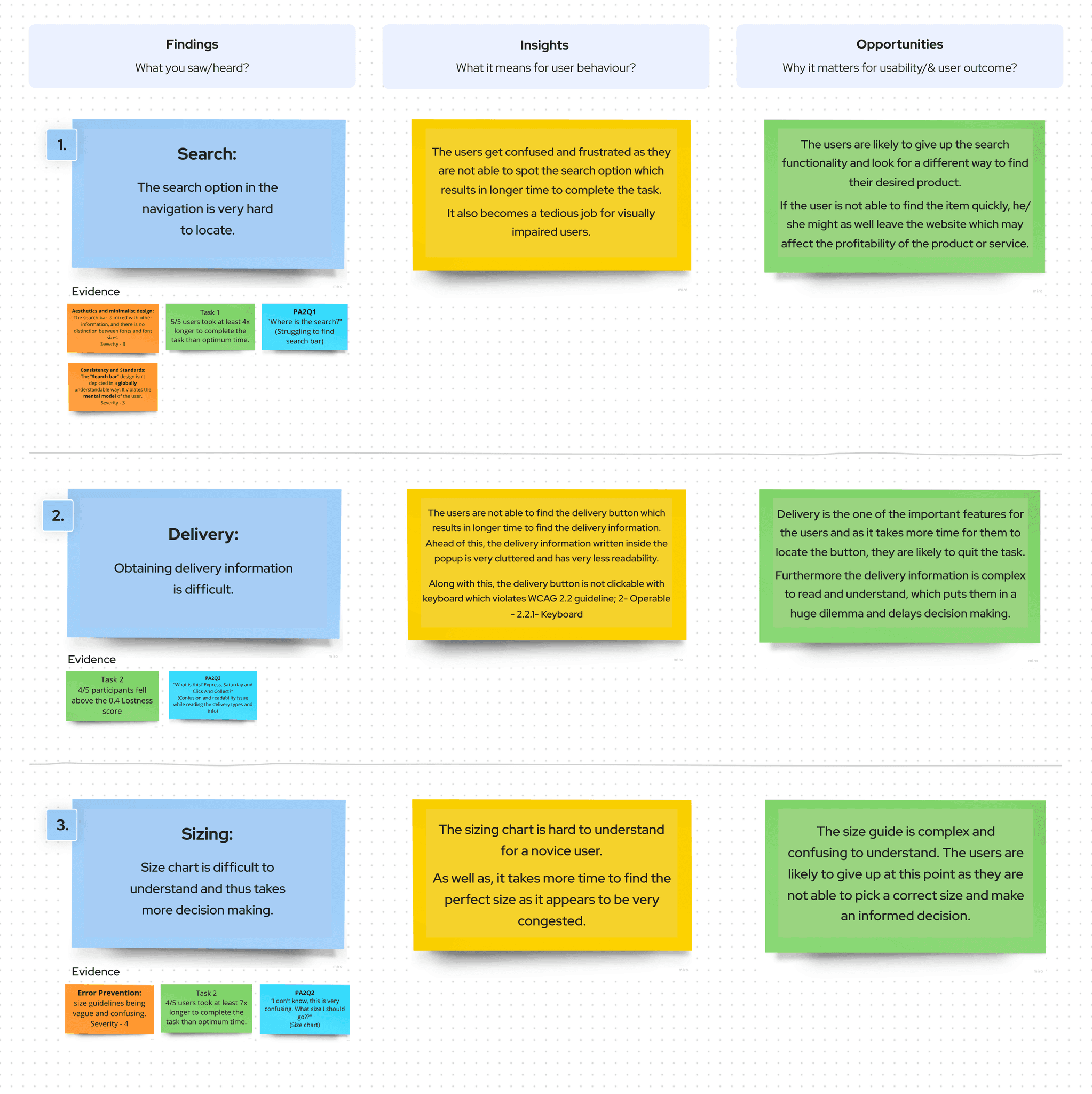
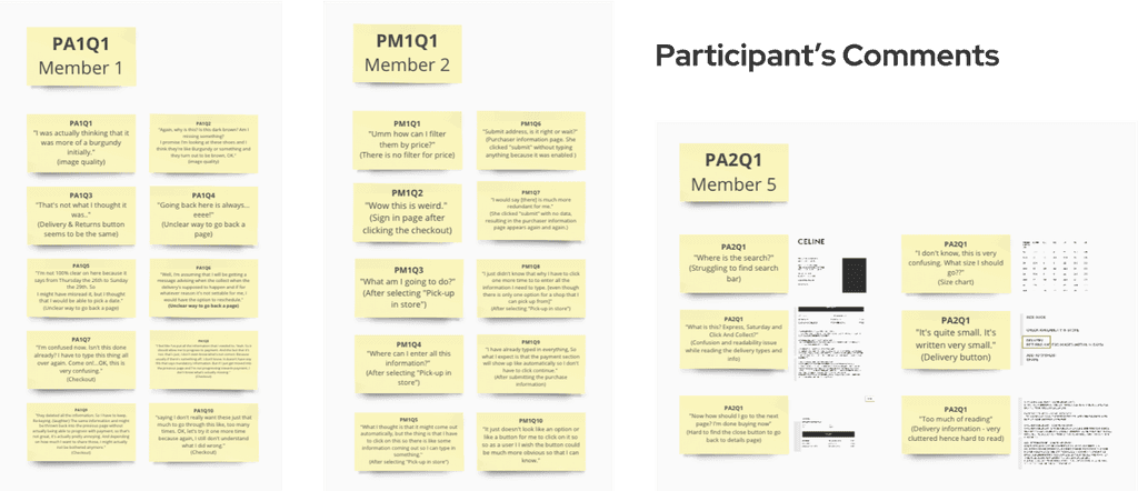
We gathered solid evidence to support our findings, then transformed them into valuable insights, and finally, seized opportunities from these insights. Let's explore three key findings and how they evolved into actionable insights and opportunities.
Insights Prioritisation
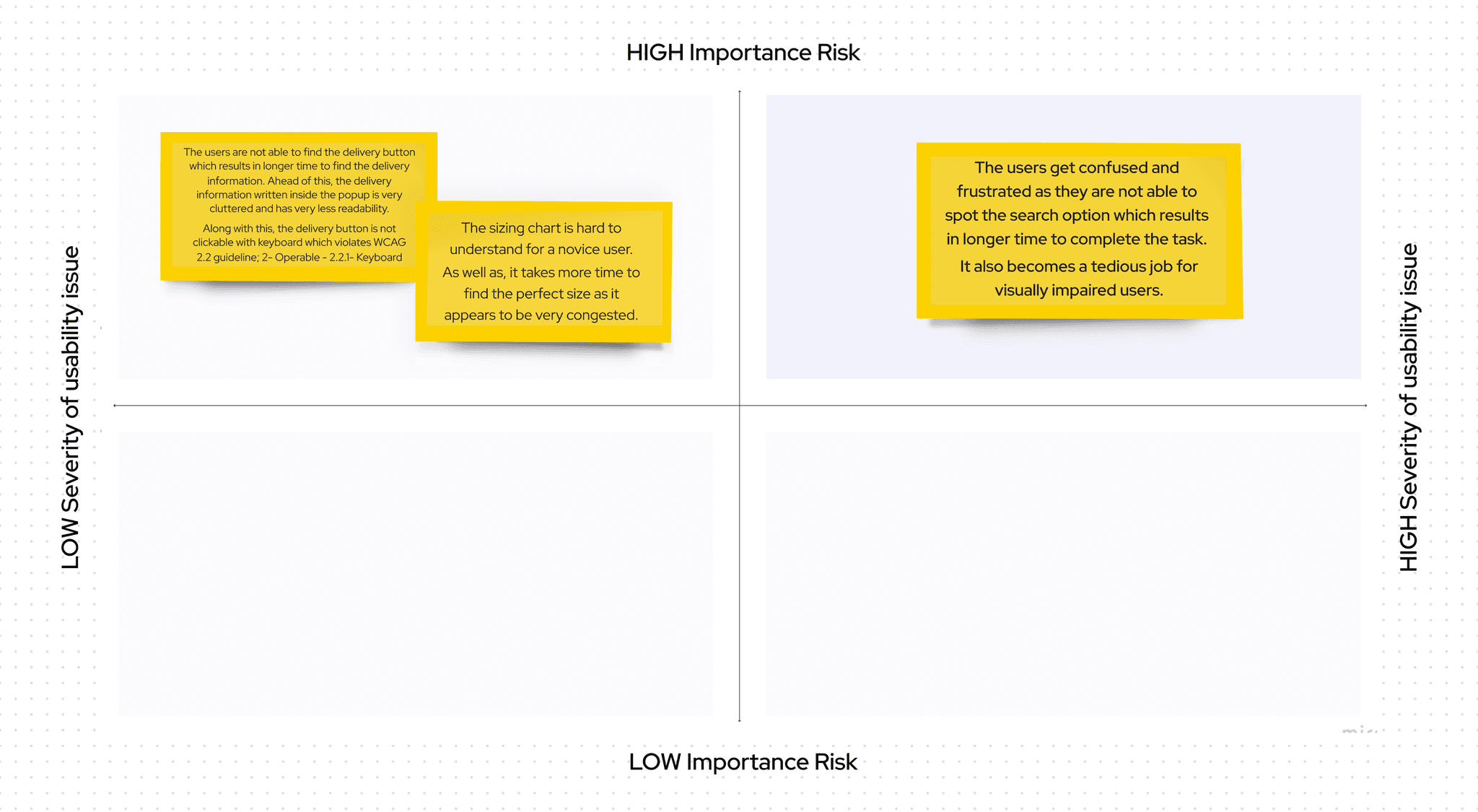
We prioritized urgent, high-impact insights, addressing critical usability issues first. A key step was incorporating a search feature into the top-priority quadrant.
Homepage Redesign
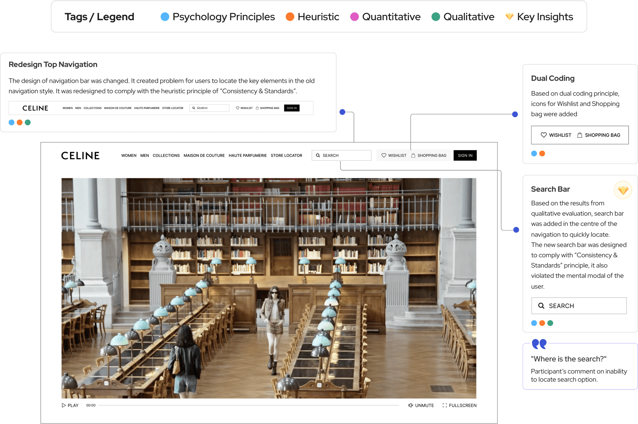
Based on the insights prioritisation, search and the top navigation bar were redesigned keeping heuristics and psychology principles at the centre focus. The above legend shows which methods, principles and insights were considered while doing the redesign.
Conclusion and Future Directions
In conclusion, the usability evaluation of the CELINE platform revealed valuable insights into its strengths and areas for improvement. User feedback pointed out key aspects of the experience that could be enhanced to better meet their needs and expectations.
Implementation of Recommendations.
Based on user feedback, we will prioritise and implement changes to improve the identified areas.
Regular Usability Testing
Regular usability testing will be conducted to ensure the ongoing effectiveness of these improvements.
User Feedback Loop
Establishing a system for continuous user feedback to keep the platform aligned with user needs.

